


Design will be inspired by an emphasis on tactility, deep blues and the evolution of ‘greiges’ according to the 2017 Dulux Colour Trends.
Presenting a collection of globally inspired hues, saturated combinations, a cool tonal palette as well as colours that promote tactility and warmth, the 2017 Dulux Colour Trends ‘Antidote: A Colour Cure’ comprise four carefully curated themes: Sentience, Chroma, Entwine and Construct.
Motivated by the desire to combat the modern challenges we face in the digital age, the Dulux 2017 Colour Trends, ‘Antidote’, aims to offer a remedy for the senses through colour and texture. “Each year we take away an overarching concept from our research and in 2017 the emphasis on connection, tactility and balance prevails. There is an ongoing desire to create havens that cater to all our senses which will see the prominence of textures blended with muted hues next year,” says Dulux Colour Expert, Andrea Lucena-Orr. “Deeper blues and greens such as Dulux Deep Arctic are predicted to be the dominant colours in 2017 and we will also see a rise in the popularity of earthy greens such as Dulux Army Fatigues. Greys and greiges which have evolved to feature subtle undertones will also be in demand.
Photographer: Lisa Cohen
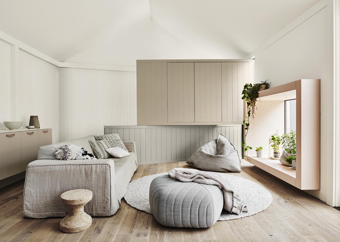
Inspired by this yearning to create a tactile environment, the Sentience palette promotes harmony through its subtle pastels and soft neutrals including new Dulux colours, Beige Mystery and Vintage Beige. Textures in washed earth tones using Dulux Suede Effects add another dimension to this scheme to imitate earth’s natural materials such as clay, minerals, stone and wood,” says Andrea.
Photographer: Lisa Cohen
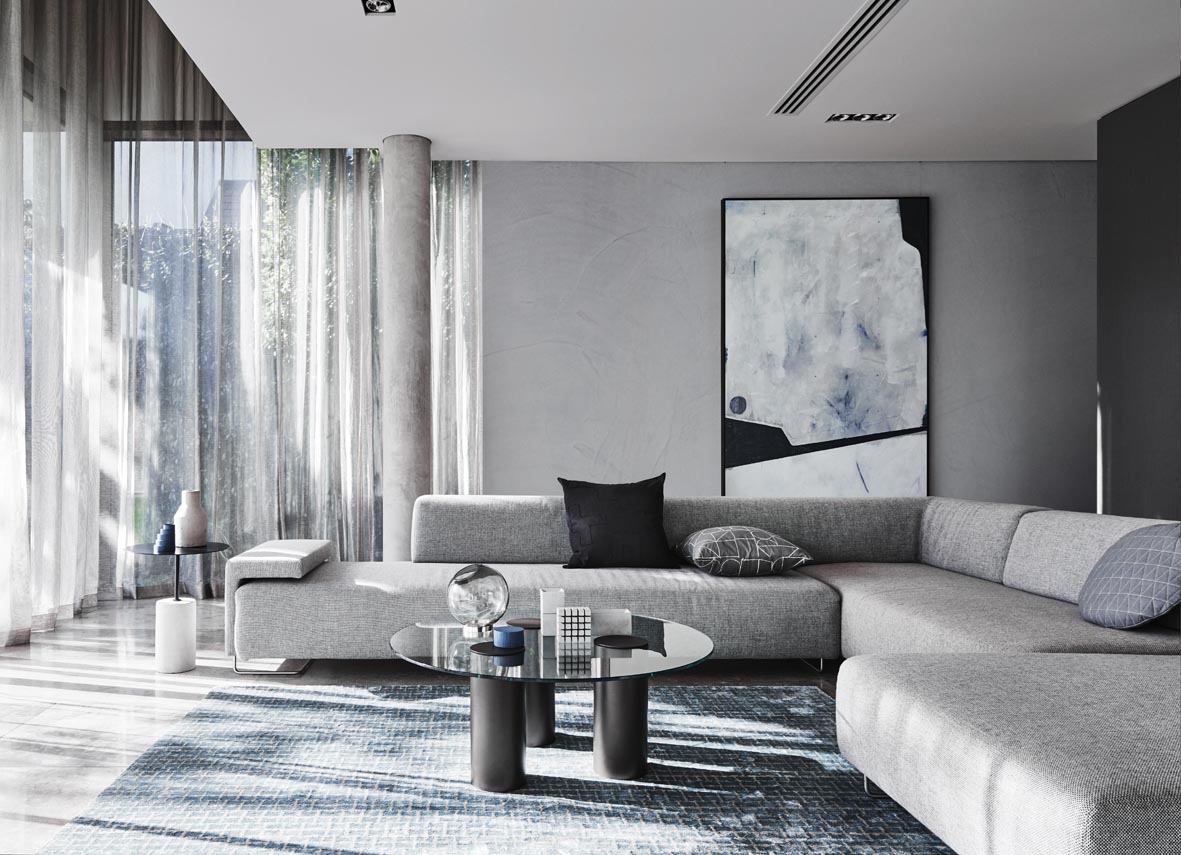
With a heavier focus on texture, the Construct palette inspires pared back beauty with the inclusion of industrial influences and metallic accents using new Dulux Concrete Effect and Dulux Metallic Effect, as well as deep inky blues to add interest. “The combination of those deep blues, subtle greys and the rawness found in concrete with splashes of copper offers the perfect components to create understated luxury; a look anyone can achieve,” Andrea says. According to Andrea, reds with a burnished edge will also emerge as a trend next year, influenced by the mix of tribal and South American themes which prominently feature in global design and interiors.
Photographer: Lisa Cohen
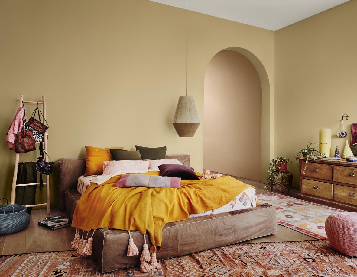
Reflecting this trend, Entwine, a palette that embraces the idea of connection and takes its cues from the simplicity of weaving, features an eclectic interior style incorporating rich shades that are deep, yet earthy and unique. “As a result of our research, we are seeing colours such as red, burgundy, brown and oranges being combined with an unexpected twist of zesty yellow or blue, inspired by landscapes from South America to the Middle East,” says
Andrea.
Photographer: Lisa Cohen
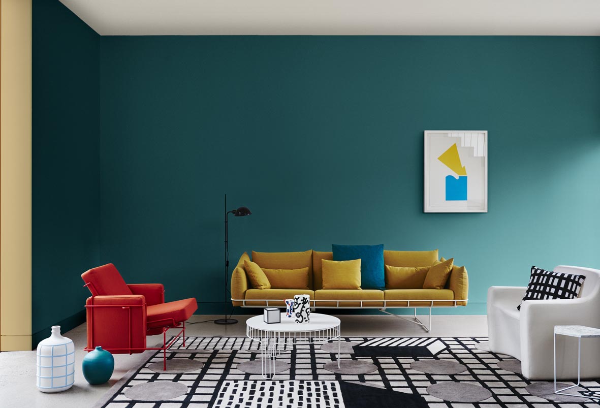
Making a daring statement is easy with the striking Chroma palette. With inspiration taken from the Memphis and Bauhaus movements, peach, melon, yellow and teal hues are combined with optical illusions, layered materials and reflections.
The offering of colours from the 2017 Dulux Colour trends deliver a simple, yet effective way for homeowners to add personality and ambiance to their homes. “Create a positive change in your space by adding a little colour or further dimension with texture. You can paint a whole room or a small nook – any new colour or finish reflect an interesting new feel to your space. Use colour in areas within the home that present high impact, for instance, the entrance where you greet your visitors or the main living space where you spend the majority of time. Even the smallest touch of colour can help personalise your home,” Andrea says.
Developed with the expertise of stylists Bree Leech and Heather Nette King, along with Dulux Colour Expert, Andrea Lucena-Orr, the four palette themes that form ‘ANTIDOTE: A Colour Cure’ are the result of extensive research into international trends. Inspiration has been drawn from a multitude of entities including design trade shows, fashion, technology and media.
For more information visit dulux.com.au


