


Pantone, an American global leader in colour science and technology has just released their choice of Colour of the Year for 2015. Here’s part of their press release:-
“Much like the fortified wine that gives Marsala its name, this tasteful hue embodies the satisfying richness of a fulfilling meal while its grounding red-brown roots emanate a sophisticated, natural earthiness. This hearty, yet stylish tone is universally appealing and translates easily to fashion, beauty, industrial design, home furnishings and interiors.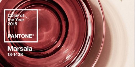
The Versatility of Marsala
- Equally appealing to men and women, Marsala is a stirring and flavorful shade for apparel and accessories, one that encourages color creativity and experimentation
- Flattering against many skin tones, sultry and subtle Marsala is a great
go-to
color for beauty, providing enormous highlight for the cheek, and a captivating pop of color for nails, shadows lips and hair. - Dramatic and at the same time grounding, the rich and full-bodied red-brown Marsala brings color warmth into home interiors
- An earthy shade with a bit of sophistication, texture is the story in print and packaging. A matte finish highlights Marsala’s organic nature while adding a sheen conveys a completely different message of glamour and luxury.

How it was chosen and past winners:
The Colour of the Year selection requires careful consideration and, to arrive at the selection, Pantone combs the world looking for colour influences. This can include the fashion and entertainment industries – including films that are in production, the world of art, popular travel destinations and other socio-economic conditions. Influences may also stem from technology, the availability of new textures and effects that impact colour, and even upcoming sports events that capture worldwide attention. For 15 years, Pantone’s Color of the Year has influenced product development and purchasing decisions in multiple industries, including fashion, home and industrial design, as well as product packaging and graphic design. Past colors include: For 15 years, Pantone’s Color of the Year has influenced product development and purchasing decisions in multiple industries, including fashion, home and industrial design, as well as product packaging and graphic design. Past colors include:
|
So that is how and what was chosen – do you have any thoughts, are you seeing this being used?
Have your say…..
For more information visit www.pantone.com
