“Light Levels – Ebenen des Lichts“ is what Lucie Koldova calls her design for “Das Haus – Interiors on Stage”. And as the name says, everything here in 2018 will revolve around light and its importance for living.
 In the interpretation of the young Czech designer, “Das Haus” at imm cologne 2018 will become a journey through various emotional states. Each of the rooms arranged around the central living room/dining room stands not only for a practical function in keeping with everyday requirements, but also for an emotional need. And in Koldova’s house this will be transported less by the furniture than through different light moods, transparencies, materials and colours. One thing is clear: this “Haus” will be very sensual, but also minimalist. For the Prague resident, a home should not only be a place of retreat, but also a free space with lots of air and light for thinking. Lucie Koldova tells a story of living – not with words, but with light.
At imm cologne 2018 you will be coming with an interpretation of the living space simulation “Das Haus – Interiors on Stage” in which a technical theme plays a main role for the first time, that of light. You are known for your excellent light design. Does this mean that Das Haus 2018 will be a “light house”?
I called my design “Light Levels” to make clear that light influences the mood of a room in very different ways, and can thus also assume entirely different functions in the living space. Of course light plays the main role in my design – that was also the basic idea with which Koelnmesse approached me. Nonetheless, Light Levels pursues a holistic approach. I want to equip “Das Haus” with pieces I love, with furniture that makes the lighting concept complete, makes it a whole. I find that incredibly interesting!
 Will one see a certain affinity for technical features in the “Haus”, or will it once again be a calm anchor in which one can recover from work and always being online?
I myself haven’t had a television since I was 18. I have enough electrical tools and screen devices in the studio. When I’m at home I want to spend time with my family or sometimes be alone. There’s no escape from the Internet anyway. The linking is omnipresent. Everyone who enters “Das Haus” is connected with everything at all times. So why should it be especially emphasised there?
Is designing with light a different task than designing “classic” furniture?
When designing furniture, most of the features are already more or less predefined. A table, for example, stands on the floor and has one to four legs. Sometimes someone is able to create truly new design or added value, but often they just restyle it and change something that already worked well. Light can be changed in every direction. It’s not just about finding a form. Lights are objects that exist in two states: when the light is turned off, the light has an effect of its own, as a sculpture, and when the light is turned on, one has a completely new object that can differ from the former. One can play with reflections or with transparency. Semi-transparence sometimes results in an effect like that of dust, and sand-blasted glass distorts the light. The contrasts between illuminated and non-illuminated elements can also look very interesting. A light can beautify a room and doesn’t even have to look like a light source; it can have an endless number of forms and materials. I love the power of expression of light, its diversity. There is nothing else that can be played with so well.
 Have you also designed a new light for “Das Haus”?
Two, in fact. Both for Brokis. The jack-o’-lanterns welcome visitors right at the entrance …
In German we would more likely call that ghost light or fireflies …
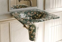
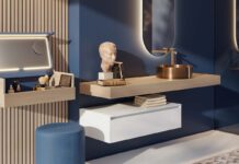
Yes, I like names with a narrative character. In this case it awakens associations with a small ball of light that someone has captured to be guided home by the light of the little beetle. And then I developed a light system for the area around the bed, the relaxing zone, that functions both as a stand-alone product and for tailored use in the Ivy combined system. Like glass branches. I wanted to pose a completely different task for myself and Brokis: nothing forceful, but instead small lights that are gentle, soft and feminine. I especially wanted them for the bathroom. That’s how I would want to live: not entirely minimalist, like an architect might be inclined to plan, but instead also with some space for softness and emotion. The branches of Ivy illustrate this very well. We also designed a completely new washing stand of glass for the bathroom and Antonio Lupi, for which there are bowls that correspond in form.
The living room in the middle, with its large, star-shaped Puro lights, has a completely different effect, and the Inspiration Room with its backlit, window-like walls seems quite cool in comparison with the relaxing area. Is that deliberate?
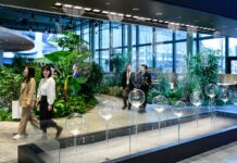
I find it amusing to have two-metre sparklers hanging in the room. There will also be a smaller version, reminiscent of a fire to gather around. It is a representative room for eating, for meeting with friends and acquaintances, a room for showing off. A different light is required than that for relaxing. The Spirit Room, designed in concrete, is a metaphor for a sacred, stone-like space. I look for the appropriate materials and the right light for each room, each feeling and each function. It is ultimately a house of ideas and symbols, and not a showroom for exhibiting my favourite pieces.
 Could you imagine living in such a house?
It’s the right house for this place. So, why not? But my own house would be more like a glass cube with many possibilities for looking outward. However, in the exhibition hall, “Das Haus” needs metaphorical windows, so the Inspiration Room uses light to convey my idea of an open studio with big windows and areas.
With its many angles, however, it doesn’t seem like a normal, straightforward house, but instead more like overlapping cubes that have been pushed together and that join together like honeycombs …
Yes, and seen from above, the result is somewhat reminiscent of a star. There’s a surprise waiting around every corner. I like the contrast between the hard angles and the soft atmosphere. The more one goes into detail, the softer is the living environment, especially in the bathroom.
So, the softness of your design language is more to be found in the details?
Yes, that’s right. However, a soft language of form doesn’t mean that everything has to be as soft as chewing gum! No, but seriously: I have a strong personality and know how to set my limits. But at home in my protected zone I can be as soft as I want, because there I am well-anchored and sheltered in my shell. That’s why the walls of my “Haus” in Cologne need to be solid and clearly defined. In addition to this, with an open architectural concept or with textile wall elements, I wouldn’t have been able to work with light in the way that I intended. In order to control light, I need solid boundaries. Otherwise everything mixes together. I build light cells to create varying ambient zones. I want “Das Haus” to shine brightly. With all the means at my disposal.
 The “Das Haus” series is a holistic residential home simulation of architecture, interior design and furnishing, which a different designer is invited to design each year by the international interiors trade fair imm cologne. In an area of around 180 m², the guest of honour can thus make a personal statement on contemporary living in the middle of one of the largest interiors trade fairs in the world, more precisely in the Pure Editions hall 2.2.
For more information visit http://www.imm-cologne.com


